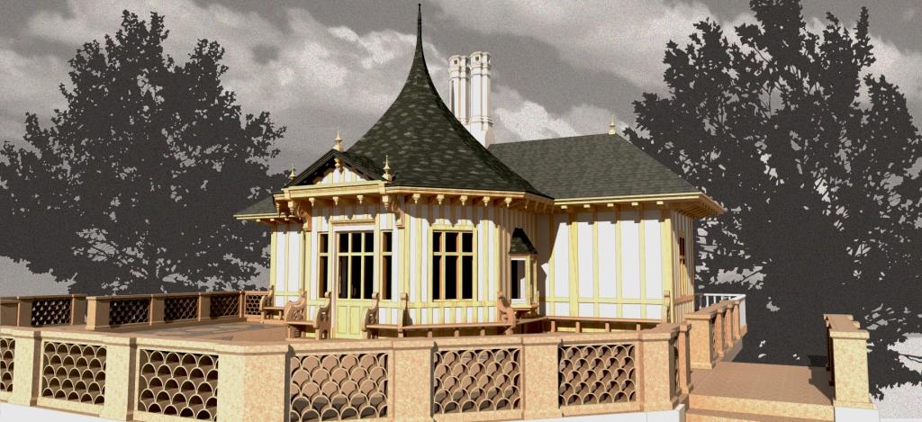
The Pavilion Project is having a summer of transition. With the architectural model complete (preview below), we are in the midst of building the more permanent, interactive, and informative website for the project, currently scheduled for release this fall. We’re also hard at work on an accompanying book project: a short-form multigraph for Palgrave Pivot in “The Digital Nineteenth-Century” series. As the slower pace of our starter blog shows, most of our energies have gone towards these efforts which we’re excited to share with the world soon. Please stay tuned!
Texturing the Rooms
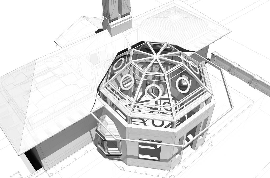
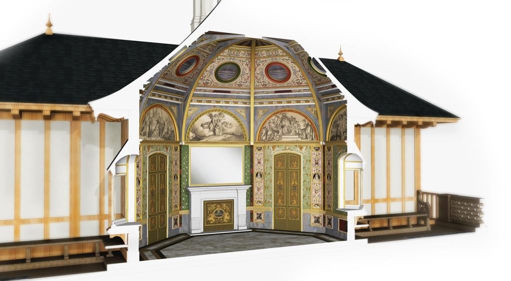
The pavilion’s architectural model has moved into a new phase as of the start of the Spring 2015 semester. Our tireless graduate research assistants have now begun “texturing” the model in earnest. We plan to eventually derive several versions of the model in varying textured circumstances. But for now, we’re interested to prototype a fully textured model to get started with. Many of the materials (wood grain, roof shingles, etc) derive from what’s available or importable in Sketchup. The more interesting features come from our scans of Gruner — frescoes, lunettes, wall décor — which get skewed and stretched like virtual wallpaper over the architectural polygons. Take a look. Before:

And after texturing:
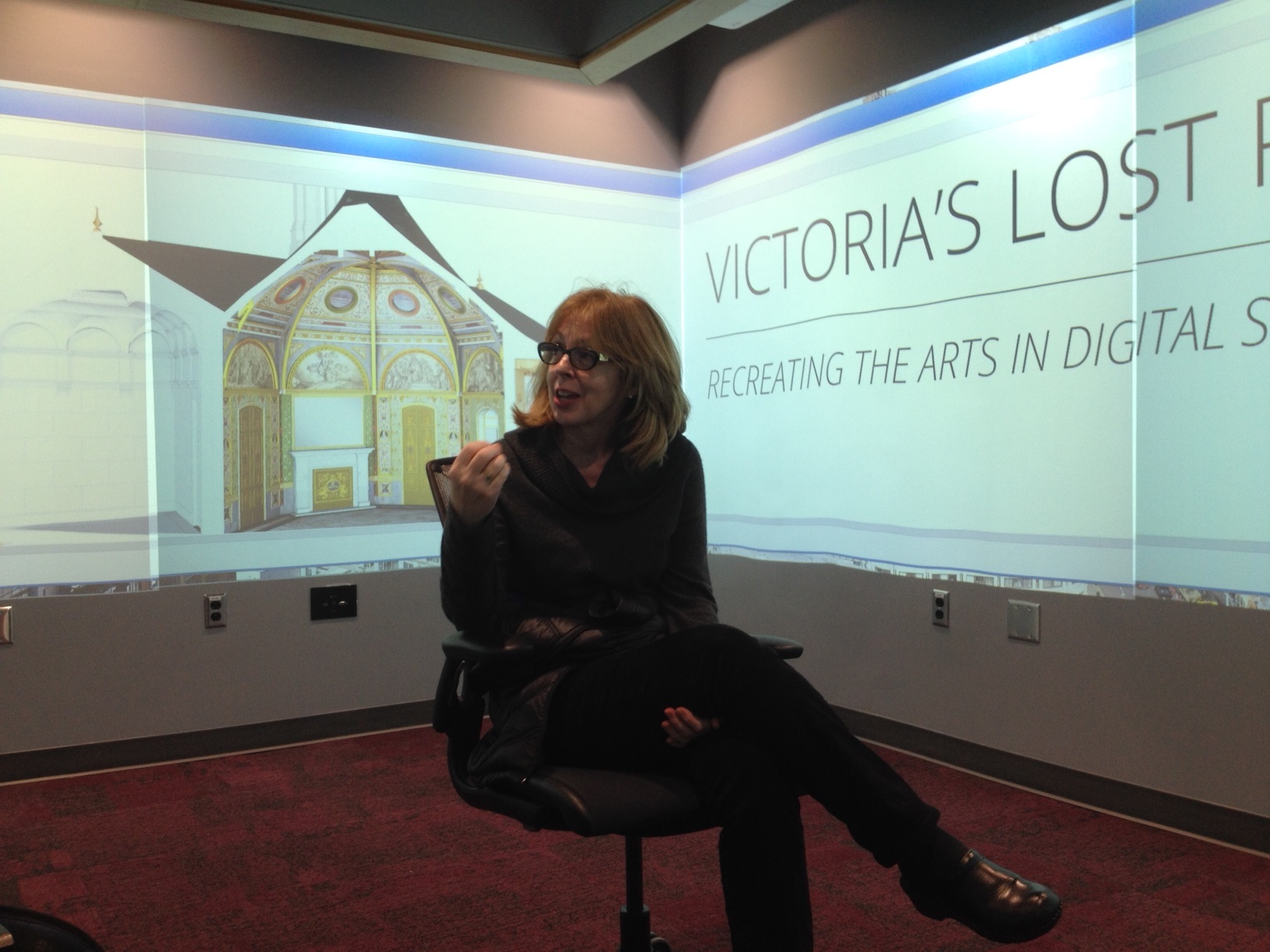
We demoed some of these early textured spaces in the new Visualization Studio in DH Hill Library. In fact, our model came to texture that room itself, covering its blank walls with images of our work in process. This square room offers 360-degree projection, not necessarily high-definition or immersive, but suitable for a more encompassing experience of what you’re looking at, whether a series of discrete images or a panoramic view. As with the iVisit mobile applications, these projections instantly change your sense of the model by the simple fact of encountering it in a differently embodied way. A room like this doesn’t simulate virtual environments like a “CAVE”; nevertheless, it does invite consideration of the model and its features with an alternate proprioception. We’re pleased to offer the NC State library content featuring humanities research for its demonstrations; we’re also excited to begin developing a navigational website which starts to let users traverse the space, whether in the visualization studio or on a remote screen. Stay tuned.
Victoria’s Garden Pavilion at the Victorians Institute Conference – October 2014
Five of our team members recently attended the 43rd Annual Victorians Institute Conference in Charlotte, North Carolina where we presented our work to a most enthusiastic audience. Tony Harrison, Sharon Setzer, Paul Fyfe, Sharon Joffe and David Hill each presented a paper on a particular aspect of the project. Our panel, “Queen Victoria’s Lost Pavilion,” consisted of the following papers:
Sharon Joffe: “”A Little Hot-Bed of Fresco Painting’: A Historical Overview of Queen Victoria’s Garden Pavilion at Buckingham Palace”
David Hill: “Doors to the Past: Virtually Reconstructing the Pavilion”
Sharon Setzer: “Contemporary Accounts of the Garden Pavilion: ‘Perfect Bijou’ or Royal Blunder?”
Anthony Harrison: “The Mysteries of Victorian Taste”
Paul Fyfe: “Radiant Virtuality”
The theme of the conference was “The Mysteries at Our Own Doors” and our panel certainly captured the spirit of the weekend. Audience members were very excited by the pavilion project and panel attendees asked many interesting and thoughtful questions. We left the conference with a renewed sense of enthusiasm for our project and a strong desire to continue the work and research already in progress. The next few months promise to be most exciting ones for our project as we continue to perfect the digital model itself and to gather research materials for our website.
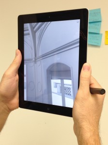
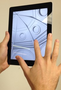
I include here two pictures of the iVisit 3D model on an iPad. We used the iVisit 3D app to render a 3D view of the pavilion’s interior.
Pavilion Poster at DHSI
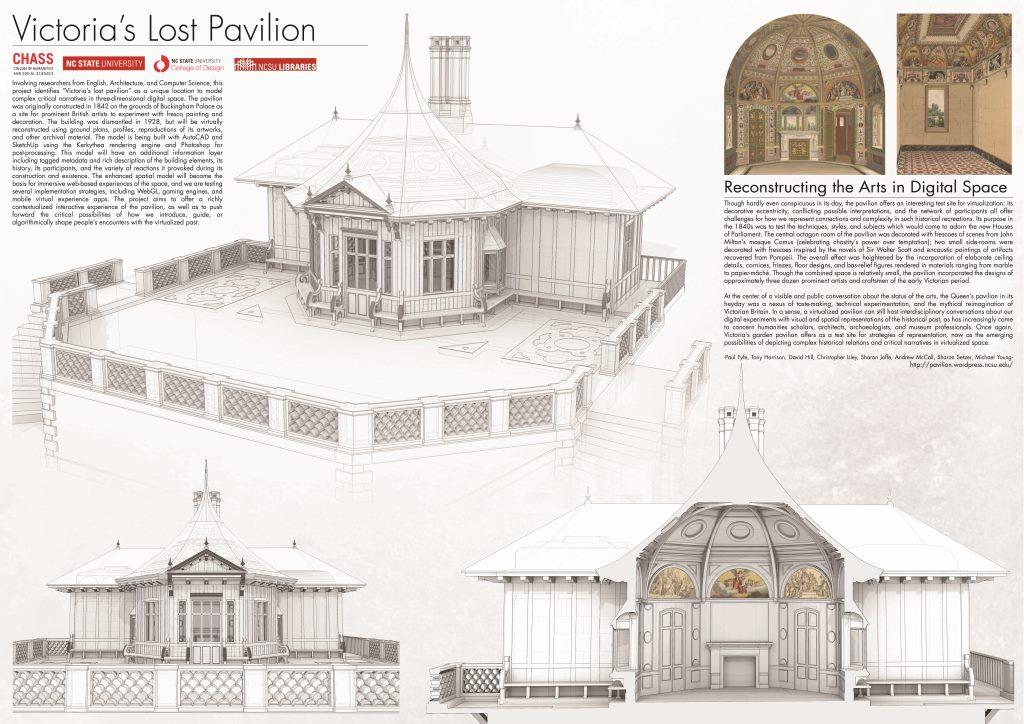
Three of our project members (Paul, Sharon, and Sharon) are traveling to the Digital Humanities Summer Institute (DHSI or #dhsi2014) at the University of Victoria for training in various subjects as well as to make the Pavilion project’s public debut! Presented for the first time as a poster.
 We’ve had some wonderful conversations and suggestions already. We’ve all been surprised at how, to outside eyes, the project seems so far along. The irony, of course, is that the model represents the preliminary development stages of a project which has miles to go in terms of our own aspirations. Still, it’s gratifying to realize that something has been accomplished. For us at DHSI, this also represents the first time presenting anything as a poster. Fortunately, our graduate research assistants make posters about every week and cooked up a beauty. It features the first image they’ve made with the architectural model overlaid with the pavilion’s artworks.
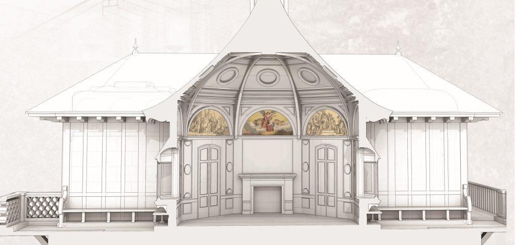 In color and sepia in a few lunettes, these reproductions of frescos from the central octagon room offer a glimpse of the model’s eventual texturing. They also present yet another problem born of process: whether or not to represent them in color, grayscale, at what resolution, and with what sort of fidelity. Our GRAs have already had to wrestle with issues of competing architectural documentation: no building ends up exactly as drawn, and this building has more than one set of plans. Now we likewise must reckon with the status of digital reproductions of artworks within our model. Cascading on those decisions are the host of digital art historical problematics which attend such remediation. How can we best represent our sources and the limitations of such depiction as well as invite viewers to consider historical art in virtual place? At the moment it seems to some like the finishing touches are going on the model, we’re starting to realize the early obstacles of a much longer development plan. It’s a good paradox to experience. Thanks for your support, DHSI!
Elegant Scaffolding
We recently received the happy news that several of our staff will share a poster about the pavilion project at DHSI in Summer 2014. Not only will this represent the first public demonstration of our in-process model, it represents the first time our English department team members have presented a professional poster. We asked our colleagues in architecture, “Do you all ever make these?” The GRAs laughed, as they generate these routinely, sometimes weekly, for group critiques in the College of Design.
We’ve reached an interesting moment in the project when conversations are turning to what and how we collectively plan to share. As a group, we’ve agreed since the start on preliminary long-term plans for the project. The poster has pushed us to decide upon what, in the parlance of research offices, might be the project’s discrete “outcomes” along the way. Now seeing the horizon of the project’s seed funding, what sorts of incremental successes can we deliver? And given the competitiveness of larger implementation funding for such projects, how might we structure the project to succeed as a research platform even given the absence of such support in the future?
We have some plans and have adjusted our research and production schedule to hopefully share the initial models at DHSI. For me, this has valuably complicated my naive thinking about projects beyond the spectrum of proposal -> process -> product. Many conversations in humanities computing and DH have emphasized process as itself a viable outcome of the work. In other words, work in DH even if necessarily inconclusive delivers lessons about how we conceptualize, execute, and reflect on our scholarly suppositions. In a similar spirit, our architecture GRAs have advised us to approach a poster as a statement of process, rather than as a billboard for a completed exercise. At the same time, I’ve felt a weariness in the DH community and in its interlocutors about seeming stuck in process, about re-engineering shortcomings as a model for success or what has been called the importance of failure. As a digital media librarian objected at a recent THATCamp: You know what’s better than failure? Actually making something that works.
That can be a tall order given the scale and ambition of the digital humanities and interdisciplinary projects that scholars, students, and staff have been encouraged to imagine. It also sets up a false binary that breaks down during the experience of project management. Bethany Nowviskie calls this necessary realization “graceful degradation“: how we imagine and plan for the fruitful afterlives of projects given the shifting sands of funding and sustainability. What about envisioning this from the start of the project, as opposed to its end, in the same spirit? Projects can equally possess a “elegant scaffolding” to deliver useful structures throughout their life cycle.
In journalism, the “inverted pyramid” refers to the technique of front-loading essential content in a news story, starting with the lede. The farther the article goes, the more it can dilate to compass the details and implications of its central story. The motivation here isn’t just satisfying readers pressed for time: it’s to defend the integrity of your story from a ruthless editor who, pressed for space, might cut it anywhere. Along the same lines, what sorts of deliverable milestones can a project gracefully envision from its outset, as if it were periodically abbreviated? Beyond process-based lessons about, say, a half-built virtual model of a historical building, what can we generate along the timeline of our gradually increasing investments of time and research?
For the pavilion project, our GRAs are generating virtual scaffolding of escalating detail and grace. It’s our job, as a team, to envision and deliver gradual implementations of our collaborative work, inclusive of lessons about process as well as stuff that, in a variety of scales and contexts, actually works. Stay tuned.
