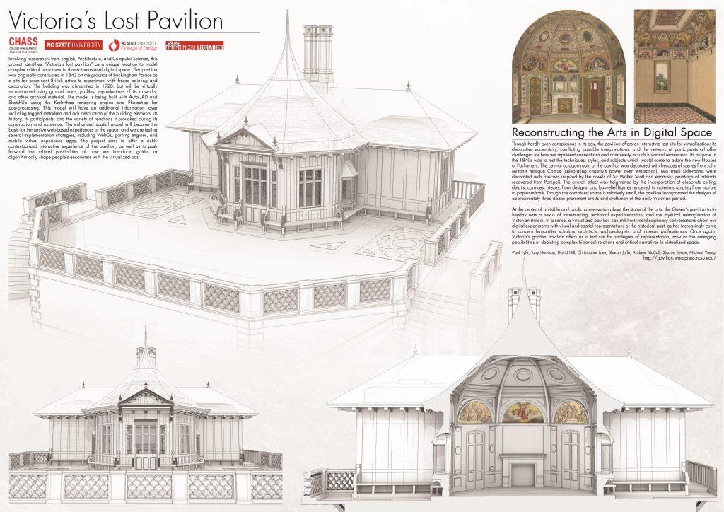
Three of our project members (Paul, Sharon, and Sharon) are traveling to the Digital Humanities Summer Institute (DHSI or #dhsi2014) at the University of Victoria for training in various subjects as well as to make the Pavilion project’s public debut! Presented for the first time as a poster.
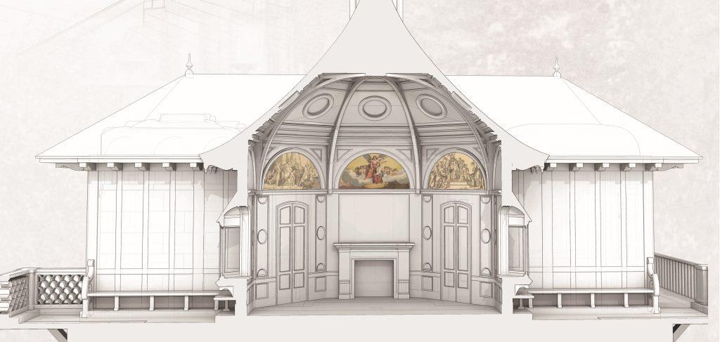
 We’ve had some wonderful conversations and suggestions already. We’ve all been surprised at how, to outside eyes, the project seems so far along. The irony, of course, is that the model represents the preliminary development stages of a project which has miles to go in terms of our own aspirations. Still, it’s gratifying to realize that something has been accomplished. For us at DHSI, this also represents the first time presenting anything as a poster. Fortunately, our graduate research assistants make posters about every week and cooked up a beauty. It features the first image they’ve made with the architectural model overlaid with the pavilion’s artworks.
 In color and sepia in a few lunettes, these reproductions of frescos from the central octagon room offer a glimpse of the model’s eventual texturing. They also present yet another problem born of process: whether or not to represent them in color, grayscale, at what resolution, and with what sort of fidelity. Our GRAs have already had to wrestle with issues of competing architectural documentation: no building ends up exactly as drawn, and this building has more than one set of plans. Now we likewise must reckon with the status of digital reproductions of artworks within our model. Cascading on those decisions are the host of digital art historical problematics which attend such remediation. How can we best represent our sources and the limitations of such depiction as well as invite viewers to consider historical art in virtual place? At the moment it seems to some like the finishing touches are going on the model, we’re starting to realize the early obstacles of a much longer development plan. It’s a good paradox to experience. Thanks for your support, DHSI!