Category Archives: NCSU

Ludwig Gruner in the New York Public Library

Sharon L. Joffe

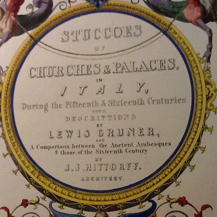
My recent visit to the New York Public Library resulted in an excellent discovery for our garden pavilion project. We have already noted that our guiding volume, The Decorations of the Garden-Pavilion in the Grounds of Buckingham Palace, was engraved under the “superintendence of L. Gruner.” John Malcolm Russell, in his book From Nineveh to New York (Yale University Press, 1977), explains how Ludwig (or Lewis, as he was known in England) Gruner provided Prince Albert with artistic guidance and, as an engraver, produced exquisite books on architectural matters. I was fortunate to see three of Gruner’s books, all of which are housed in the Rare Book Collection of the Schwarzman Building of the New York Public Library: Descriptions of the Plates of Fresco Decorations and Stuccoes of Churches and Palaces In Italy (1844), Fresco Decorations and Stuccoes of Churches and Palaces, In Italy (1844), and The Terra-Cotta Architecture of North Italy, XIIth – XVth centuries (1867). The equally impressive Specimens of Ornamental Art (1850) is available on-line.

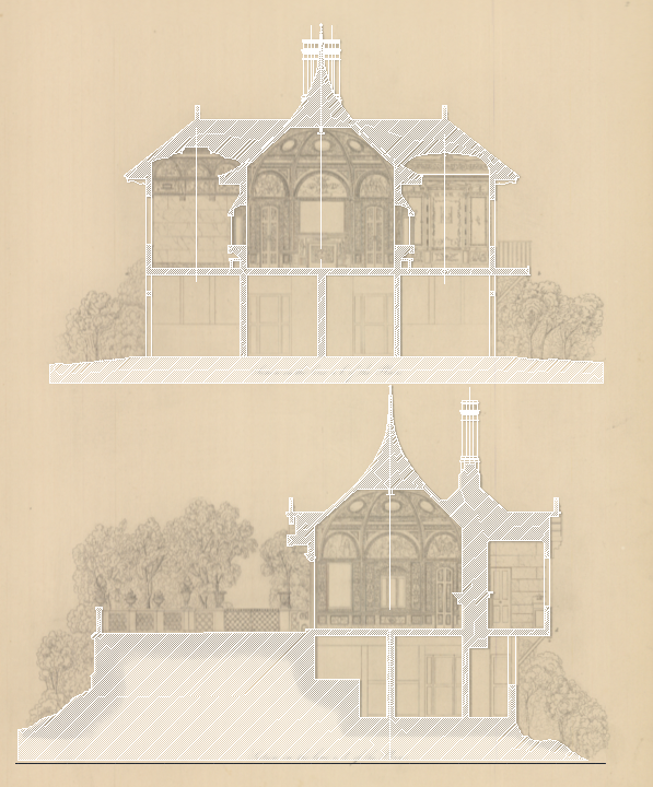
Gruner is listed as the primary author on the frontispieces of all three of these texts. An exciting find was that the frontispiece to Descriptions of the Plates of Fresco Decorations and Stuccoes of Churches and Palaces in Italy identifies Gruner as “Author of ‘Specimens of Ornamental Art;’ ‘ Her Majesty’s Pavilion at Buckingham Palace Gardens;’ ‘The Ghigi Chapel,’ and of other Illustrative Works.” The engravings and illustrations in all of Gruner’s works reminded me of the drawings in our garden pavilion text as Gruner’s style is easily recognized in each of these texts. Indeed, the descriptions of the frescoes themselves show striking similarities to the ones described by Anna Jameson in her introduction to The Decorations of the Garden-Pavilion. For example, in Descriptions of the Plates of Fresco Decorations and Stuccoes of Churches and Palaces In Italy, we read of “the richly decorated ceiling … brilliant border in deep colours… adorned with the most exquisite little stuccoes and arabesques” (40). Similarly, when describing Plate 41 (“Part of the Palace of the Viscontis and Sforzas at Cusago”), Frederigo Lose (who provided the text) notes that “…the frescoes … are executed in very bright colors; amongst which are a yellow and a green, finer than any we now possess.” The accompanying sketch (see below) seems to be drawn in a manner similar to those presented in The Decorations of the Garden-Pavilion.Palace of the Viscontis and Sforzas

The most exciting and exquisite find was the massive 1844 volume Fresco Decorations and Stuccoes of Churches and Palaces in Italy, During the Fifteenth and Sixteenth Centuries ( with Descriptions by Lewis Gruner).

Stuccoes of Churches and Palaces in Italy

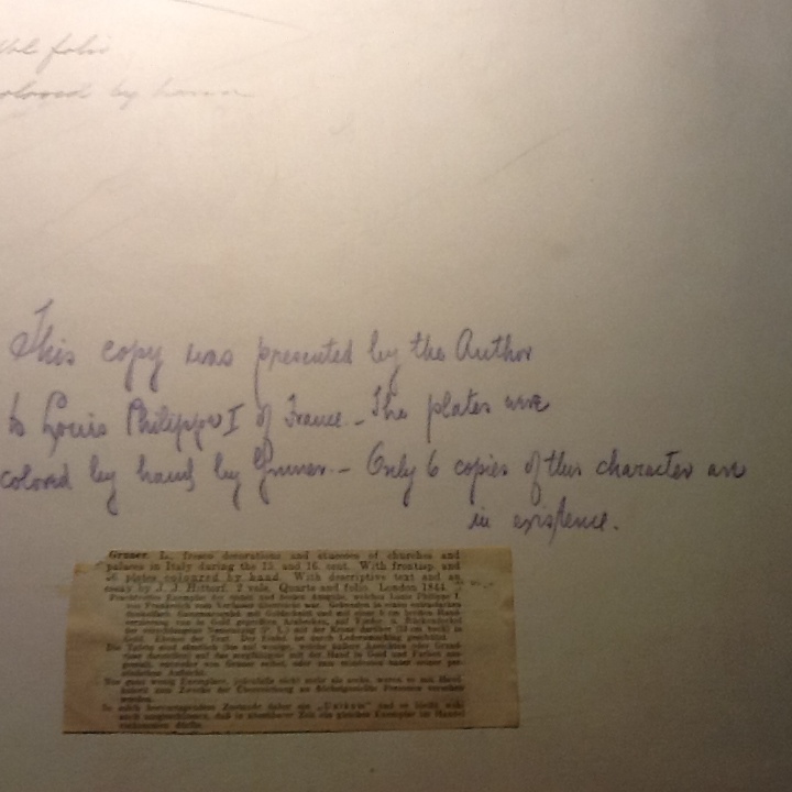
This tome was dedicated to Prince Albert and the Members of the Royal Commission on the Fine Arts “by their most obedient and very humble servant, Lewis Gruner” and was presented “by the author” (noted on the book’s inner cover) to King Louis Philippe I of France. A note added at the beginning of the book states that “The plates were colored by hand by Gruner – Only 6 copies of their character are in existence” (see image below). A newspaper clipping (unidentified source) has been attached to this page and it corroborates that the 46 plates were “coloured by hand.”

Information about King Louis Philippe's copy of the text

The most fascinating aspect of this text is found in Gruner’s Preface. He records: “At a moment when the study of art in this country appears to be guided by a new spirit, and the erection of the Houses of Parliament upon a scale of unusual splendour gives additional interest to every kind of architectural embellishment, it cannot be doubted that the access afforded to compositions of such skill and beauty, as are comprised in this work, will be gratefully acknowledged even by those Painters who efforts are directed to the higher branches of the profession.” The connection between art and the need to create a British artistic identity is clearly seen here, and connects directly with the ideas expressed by Jameson in her introduction to The Decorations of the Garden-Pavilion in the Grounds of Buckingham Palace: “The introduction, or rather the revival of Fresco Painting in this country has become, in connexion with a great national monument, a topic of general interest, an affair of national importance, and no longer merely a matter of private or artistic speculation” (5).

While these three texts did not mention the garden pavilion, they certainly showed Gruner’s ability to reproduce faithfully the art and architecture he studied and appreciated. For me, it was indeed a pleasure to be afforded a glimpse into the world of Gruner and the art he admired.


First Scans, Sketches, and Renders

Many of the initial materials for this project come from a large-format book, The Decoration of the Garden Pavilion in the Grounds of Buckingham Palace (1845) organized by L. Gruner. This book introduces the pavilion and documents its various architectural plans and artworks with an array of engraved views and depictions.

AutoCad.trace

Our able graduate research assistants have now scanned the book and are redrawing the building on top of its pages. We were stunned by these initial drawings in AutoCAD superimposed on images of the book pages. These elementary steps on the technical side seemed profound movements on the project side. Suddenly we could see the palimpsest of history, the remediation of its representative technologies from the book to the screen. New techniques of inscription upon old ones, the virtual structure appearing from adding dimensions and layers from the plan views and profiles as represented in 1845.

SketchUp_Process Model 3

Our colleague in architecture had prepared us for this: as in any new construction, the framing goes up quickly and everyone gets excited. But then the process slows way down and progress becomes less visible as the really hard work starts of determining details, resolving conflicts, conjecturing solutions. Though less immediately exciting, insights are won during that slow grind. Our GRAs move between AutoCAD, SketchUp, and Anna Jameson’s prose introduction to the pavilion in the nineteenth-century book. My colleagues in English move between illustrations of the pavilion and architectural plans. Together, we review the virtual object coming into focus and imaginatively inhabit it from our various fields. At intervals, the GRAs generate a “clay” model which strikes us with an uncanny solidity, a ghostly thing summoned into digital space from the records of the past.

Render_Left_Composite

We’re excited for each staff meeting. (In itself, this is a victory for the project.) Two weeks until the next one and what will we see? What will change as we start to project not only the building’s scale and textures but our own sense of its embodiment? What problems will emerge from the doing, how will they be modified by the archival materials and contemporary references we’re locating meanwhile? The more evidence and projection, the more questions arise.

What Victoria Saw

Among the inspirations for this project is the wonderful online exhibition of a London art exhibit from 1813. What Jane Saw offers a virtual tour of the British Institution visited by Regency crowds including Jane Austen. The site provides a room-by-room experience of historical art, most notably the paintings of Sir Joshua Reynolds, letting the user pass through different spaces as web pages and offering details and contextual information about the art on display with a mouse click. The model was built in SketchUp—a popular and accessible tool for architectural drawing, with static room views refined and softened in PhotoShop. It’s a great example of mounting a virtual exhibition on the web with a simple set of technical resources, and a great resource for researchers and students and anyone curious to experience such a model of the past.

What attracted us about What Jane Saw were also the opportunities for further development it suggests, particularly in terms of creating a more immersive experience of gallery space. In its own model, What Jane Saw idealizes how a viewer encounters rooms and artworks. Each web page lands the viewer perpendicular to a wall in a statically lit room empty of people, movements, and changing angles. Of course, this is not to discredit its achievement. But how might we further develop a more dynamic encounter? Instead of modeling an idealized experience, how might we insist on the mutable, embodied experience of art and architecture in ways that both testify to their historical condition and also foreground the mediation of art, from its Victorian production to its contemporary remediation through the digital?

Here again, the Virtual Paul Cross Project offers inspiration. Much of its press coverage celebrates the project for being a time machine, as if transporting us back to the seventeenth-century church courtyard as it really was. The VPCP does this not by stripping away the impediments to John Donne’s historical performance, but adding them all back in. In other words, at so many levels, the VPCP insists on the obstructions and mediating conditions of Donne’s performance. It foregrounds the ambient noise of a crowd in attendance. It interrupts the sermon with barks and bells. It dampens its reverberations by modeling the acoustic reflection of sound off dirty stone. It darkens the visual model by conjecturing about a cloudy November day. It employs a voice actor to use a not uncontroversial pronunciation of Elizabethan English, invoking an interpretation of the past in current scholarly debate. In other words, the VPCP faithfully depicts the past by foregrounding as many possible mediating and interpretive conditions as it can. In its model, Donne’s sermon is not some idealized thing whose historical accretions have been stripped away, or its essence recaptured. Rather, the sermon only exists as an embodied performance subject to a set of specific mediating conditions. In a way, the VPCP extends the last century’s debates about scholarly editing of texts: it refuses an “ideal” text and offers instead a virtual “edition” of Donne’s sermon which glories in its embodied, editorial, and interpretive passage from then to now. The VPCP exemplifies the “resistance in the materials” that William Morris deemed essential for art, updating it for the “resistance” which, according to recent scholars, is key to the enterprise of digital humanities.

Victoria’s Lost Pavilion endeavors to extend this important work in context of modeling historical artworks and texts in ways which foreground their embodied condition as well as the project’s own digital interpretation of them. In addition to What Jane Saw, there have been other notable efforts to recreate historical environments in virtual space, including on platforms like Second Life and gaming engines, in purpose-built projects for virtual archaeology and historical tourism, and georectified historical maps and documents. Our approach is to create a richly referenced critical edition of a lost building. At the same time, we aim to develop an immersive environment in which users can experience resistance for themselves. Our goal is not to perfectly reconstruct what Victoria saw, but to help envision the contingencies and complexities of that act of seeing and its relation to how this curious pavilion and its experimental artworks were interpreted.

What does that actually look like? Stay tuned.

—–

For a great recent take on “resistance” in DH and media, see Whitney Trettien, “Layouts, Patterns, Networks.” diapsalmata 4 Feb. 2014. Web. http://blog.whitneyannetrettien.com/2014/02/layouts-patterns-networks.html

Is this a DH project?

It was a disarming question from a colleague: “So would this be a digital humanities project?”

“Yes,” I smiled, “I think so.”

Victoria’s Lost Pavilion – or “the pavilion project” as it’s called around here – began with an open office door and a casual conversation about an idea. One colleague with an idea for a scholarly project dropped in on another who knew a bit about the landscape of digital humanities. The conversation came to include several more participants in the department and across campus, each of whom saw opportunities to engage different field conversations and disciplinary problems. What had started with a single scholar’s conference paper about allusions to Milton in the paintings adorning a little-known Victorian garden pavilion soon developed into a collective effort to virtually reconstruct, hypertextually enhance, and facilitate the three-dimensional immersion in a historical building on the web.

“Yes, this is a digital humanities project,” I told my colleague, but not because it involves digitization, or invites different levels of institutional participation, or targets external funding for development. It does all of these things, like much extant and planned DH work. But because it carries forward the existing research interests of scholars, leveraging the digital as a platform for interdisciplinary research, and exposing a mix of interesting historical and methodological and technical problems which we have only begun to anticipate.

Victoria’s Lost Pavilion takes shape at the intersection of two streams. First, the shared interests of a set of English department faculty in nineteenth-century British literature and cultural practices, particularly related to art history and museum culture, aesthetics and taste, literary history and politics. Second, the recent success of our colleague John Wall who, with an amazing international team, had just launched the Virtual Paul’s Cross Project — a historical reconstruction of St. Paul’s churchyard featuring an immersive 270˚ projection and an acoustic model of the soundscape for John Donne’s sermons. The VPCP involves architects, actors, acousticians, archaeologists, librarians, and literature scholars. And all of them can tell unique stories about why the project interests them.

In the same spirit, our team approaches the garden pavilion as the convergence of several fascinating conversations about cultural history and the challenges of modeling it digitally. For this historical structure, we can rebuild it, we have the technology. But why do so? Because, in large part, of the curious set of contradictions it embodies, the possibilities of overlapping and competing interpretations about what and how it represents, and the chance to remediate its own experimental status in digital space. What the team shares—and what I’d say really makes this a digital humanities project—is an interest in how to model complex and often conflicting narratives. How can we use the digital not to idealize the past in high fidelity, but to expose the interconnected layers of its significance and model competing stories about what it means? And how can we leverage our interest in cultural complexity to push the digital further into humanities terrain, to operationalize ambiguity and to discover interpretation?

Of course, that’s just me asking.

—–

For more on operationalizing, see Moretti, Franco. ‘“Operationalizing”: Or, the Function of Measurement in Modern Literary Theory.’ Palo Alto: Stanford Literary Lab, 2013. Web. http://litlab.stanford.edu/LiteraryLabPamphlet6.pdf. Pamphlets of the Stanford Literary Lab.